The Art of Branding a University
By Charley Steed, Associate Editor
Gail Baker and Trev Alberts came to UNO in the 2000s for different reasons, but they both realized a similar issue: the university lacked an identity.
Baker came to UNO in 2006 as dean for the new College of Communication, Fine Arts and Media (today she serves as provost for the University of San Diego). She says there was no rallying message to celebrate the efforts of faculty, staff and students.
“I think we had the advantage of not having a bad brand, but had the disadvantage of having no real brand, either.”
For Alberts, who came to UNO in 2009 to lead the athletics department, the issue was too many competing brands and the Maverick mark was out of date.
In 2010, then-Chancellor John Christensen challenged Baker and Alberts to identify a single brand for UNO.
To do that, they partnered with Torch Creative, a design company in Austin, Texas, and a committee of stakeholders. Then they got artsy.
Athletics got a sleek new Maverick. (See article on Page 21).
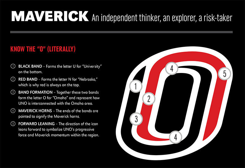
The university, meanwhile, established black as its primary color and introduced the now-iconic “O” made from an interlocking “U” and “N” to represent UNO’s ties to Omaha and the NU system. Thanks to art, it’s packed with symbolism (see graphic).
“I think that really started the sea change,” Baker says. “We knew what we were going to look like, but now how were we going to distinguish ourselves?”
To guide this effort, UNO’s Office of University Communications was created in 2013. Led by Erin Owen, who now serves as director of communications and marketing for the Buffett Early Childhood Institute, the team developed a message highlighting UNO’s key assets, namely the city of Omaha.
“Omaha is an extraordinary resource to our people,” Owen says. “With the breadth and depth of business, nonprofit, cultural, athletic, food scene, music scene — everything — I don’t think we were leveraging the city itself as a recruitment tool.”
This was the vision behind the integrated marketing campaign message “Welcome to Our Campus (Otherwise Known as Omaha),” that appeared on buses, bus benches, billboards, magazine advertisements, the terminal of the Omaha’s Eppley International Airport and even UNO-branded license plates.
It was also important, Owen says, that people’s experiences with UNO positively reflected the campaign’s message.
“This is why brand elements matter,” Owen says. “This is why relentless consistency matters. It sends a signal to the outside world that we want to make sure they have a well-orchestrated engagement with our university.”
A decade after the effort first launched, Makayla McMorris, executive director of University Communications, says the groundwork has been laid to take UNO’s public profile to the next level, which is happening through the new Access to Exceptional campaign that launched in 2018.
“I think that the only way to grow now is to really tell our story; not only on a local level, but we are focused on a regional, national and even a global level,” McMorris says. “If we want to be that premier metropolitan university, it’s going to take great stories and reinforcement of that message.”
McMorris says any UNO alumni or community members who want to be a part of the effort are encouraged to share their stories and spread the word in their communities.
“UNO is entering an exciting time where there is a lot of growth happening and a lot of partnerships developing. More and more people are recognizing our strengths and are speaking the same message that UNO is the place for access to exceptional opportunities.”