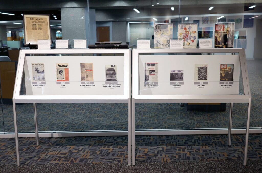
UNO Magazine launched in 2010 as the first flagship publication of the University of Nebraska at Omaha, the University of Nebraska Foundation and the University of Nebraska at Omaha Alumni Association. It continued a long-standing tradition of formal alumni publications with a new, collaborative format.
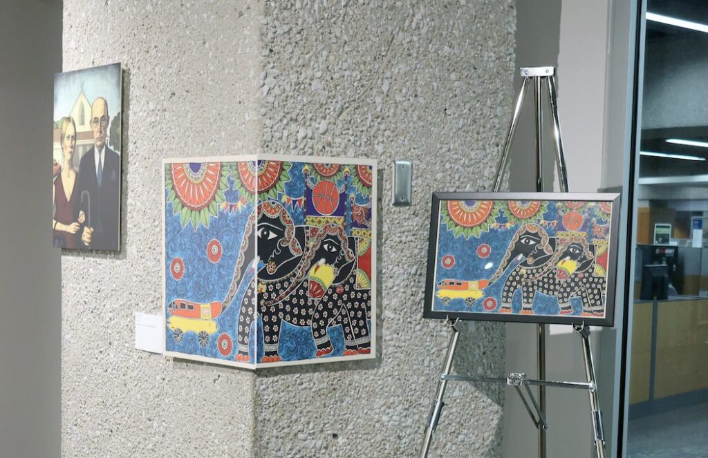
Although a university magazine isn’t novel, one feature that makes ours unique is all 38 issues of UNO Magazine have been covered in original artwork. The illustrations, paintings, drawings, photographs and collages – some by UNO alumni – delight and intrigue and depict the theme woven throughout the internal content. This summer, they were all on view at the H. Don and Connie J. Osborne Family Gallery at UNO Criss Library.
A few of the artists reflect on the process they used to create the cover and how their practice has evolved.
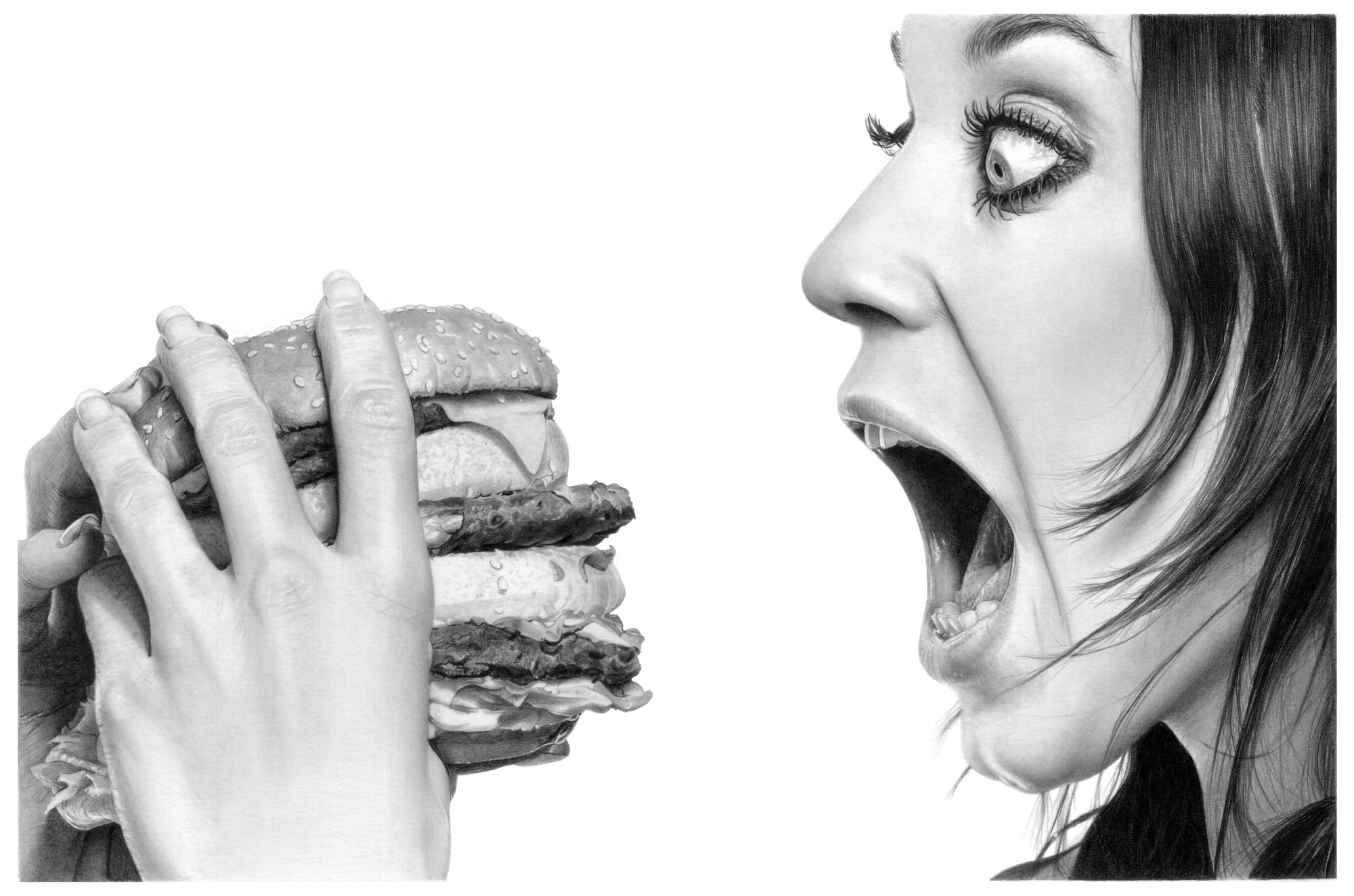
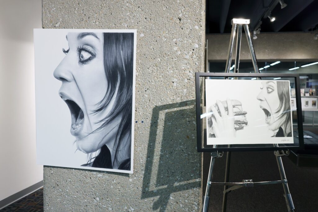
LINDA HUBER
Fall 2012
Food
Working slow and paying close attention to every line, detail and tonal value. I followed the reference photo like a map but made sure the result looked like what we see in real life. I used good Bristol paper, H, b, 4b graphite pencils. A paper stump and plain tissue for blending areas. A bit of kneaded eraser to lighten areas, and an electric eraser to brighten up teeny tiny areas.
I still draw with the same pencils, supplies and technicians. But I am semi-retired from taking on commissions. I do, however, teach drawing lessons online and have since 2010. I love helping others advance to greater levels in graphite pencil.
It was such an honor to be asked to do the cover. It truly was such a fun drawing, one of my top personal favorites. I loved that only by looking at the back cover you knew why she had that expression on her face!
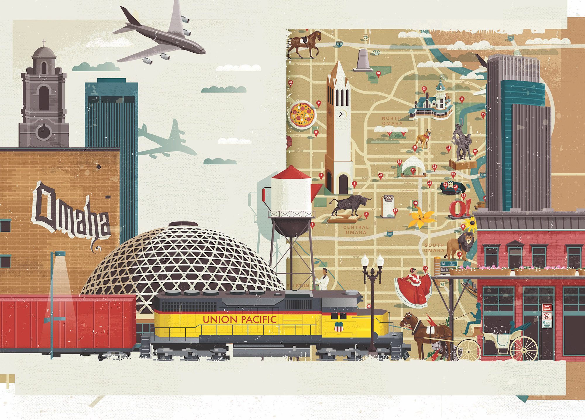
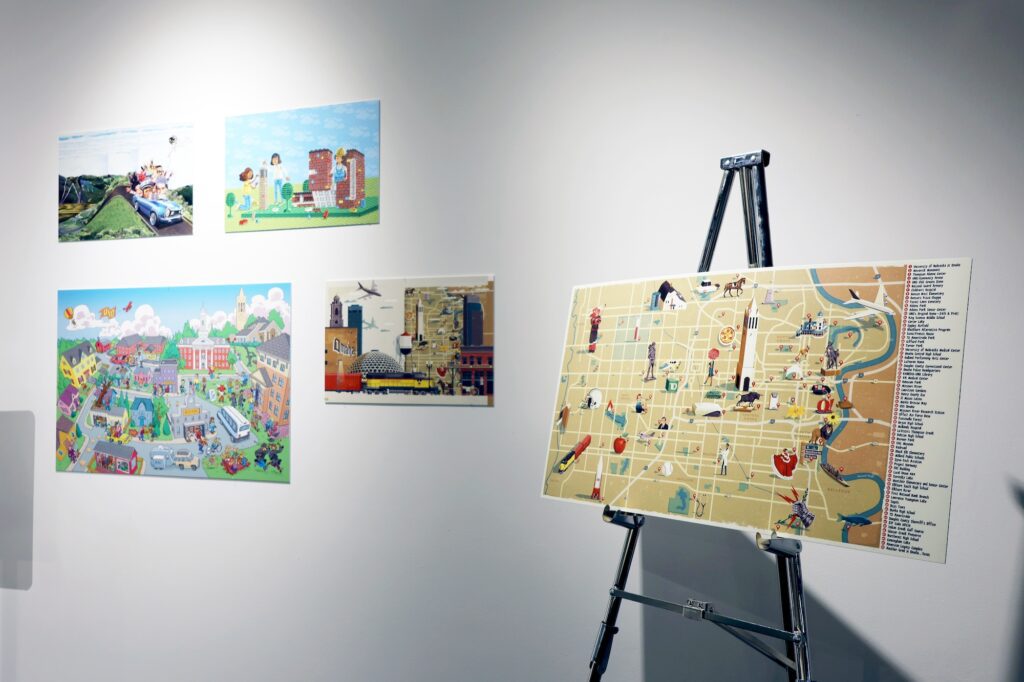
GREG PAPROCKI
Spring 2015
Omaha
When I get an art project, I first do a lot of research gathering images on the topic. Locations, people, activities, etc. Whatever is relevant to the subject I’m going to illustrate.
Then I do a very rough pencil sketch. It can be as simple as stick people. What I’m looking for is composition. From there I will use that rough sketch as a basis for drawing the elements that will go into the final art. These are much tighter but not quite final sketch quality. I scan all this and take these pieces into Photoshop where I lay them into my rough sketch which has the correct dimension for the final art. When I feel like it’s close to how I want the final art to look I’ll print this out very lightly. Then I’ll go over that sketch tightening up everything to the correct angles, correcting anything that isn’t looking right.
Once the tight sketch is done, I’ll bring this into and Illustrator file which is set up for the dimensions of the final art. Then I have to draw everything in Adobe Illustrator matching my sketch. I’ll also make my own texture with pencils, crayons, markers, etc. to help with shading and to add a traditional touch to it. Sometimes I’ll draw elements of my art using a lightboard. I’ll draw over my pencil sketch with a separate piece of paper to give a hand-drawn look. I’ll then scan that piece and bring it into my file.
The final touch, which I don’t always need or use, is a layer of textures that I created to overlay the art to give it an aged appearance.
gregpaprocki.com
Instagram: @greg_paprocki
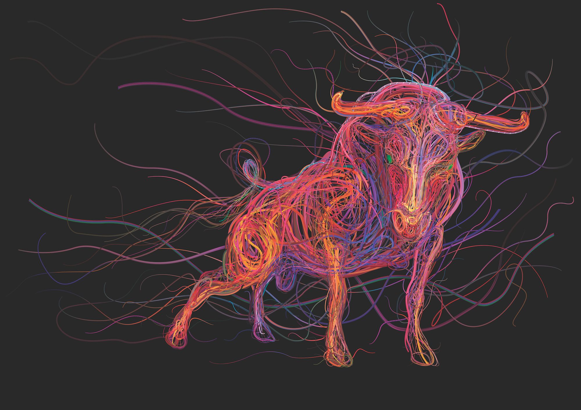
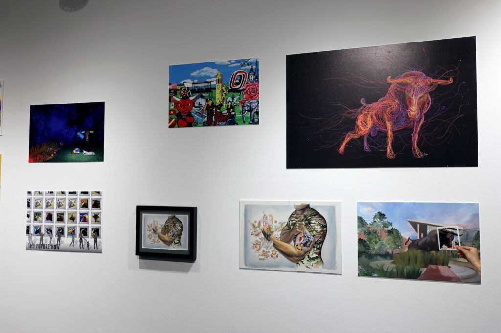
CHARIS TSEVIS
Fall 2015
Wired
Creating the bull mascot was a detailed process. I began by understanding the bull’s symbolism of strength and energy. I then crafted a rough sketch to capture its form. Using Adobe Photoshop, Illustrator and Synthetik Studio Artist, I developed a complex web of vibrant wires and cables, representing modernity and connectivity. The colors were carefully chosen for their vibrancy and symbolism. Lastly, I refined each wire and detail to ensure depth and realism in the final piece.
My artistic practice has evolved significantly. I’ve embraced advanced digital tools and explored new mediums, seamlessly blending physical and digital art. This has allowed me to push creative boundaries and experiment with unique visual effects. My focus has also shifted towards deeper storytelling, aiming to convey more profound narratives in each piece.
Recently, I’ve incorporated AI tools like Stable Diffusion and ComfyUI into my workflow. These technologies assist in various stages of my work, from initial concept generation to refining details, enhancing my ability to visualize complex ideas and execute them with precision. Additionally, I’ve been involved in more collaborative projects, which have broadened my perspective and introduced new techniques and inspirations into my art. This continuous evolution keeps my work dynamic and in tune with the latest creative possibilities.
Art at the intersection of technology excites me, opening up endless creative possibilities. Staying adaptable and continuously learning is crucial in this ever-evolving field. I’m deeply inspired by the global art community and believe in the power of collaboration and mutual support among artists to foster growth and innovation.
Equally important to me is maintaining strong ties with academia, colleges and universities. These connections provide a constant source of inspiration and knowledge. Engaging with educational institutions and thought leaders keeps me in touch with fresh ideas and emerging trends. As a true believer in the value of education, I am committed to lifelong learning and continuously seek opportunities to expand my horizons and evolve as an artist.
tsevis.com
Instagram: @tsevis

BHARTI DAYAL
Fall 2016
Journeys
It’s like going back into sweet memory lane. I became very happy when [they asked] me to create UNO Magazine cover, especially where my elephants were hooked to the Oscar Meyer wiener mobile in 2016. Since then, my paintings evolved with my experiences of life. Each of them tells a different story with different emotions and newer energy. Exploring and innovating more by pushing boundaries of limitation.
novica.com/a/bharti-dayal/2027
Instagram: @bhartidayal
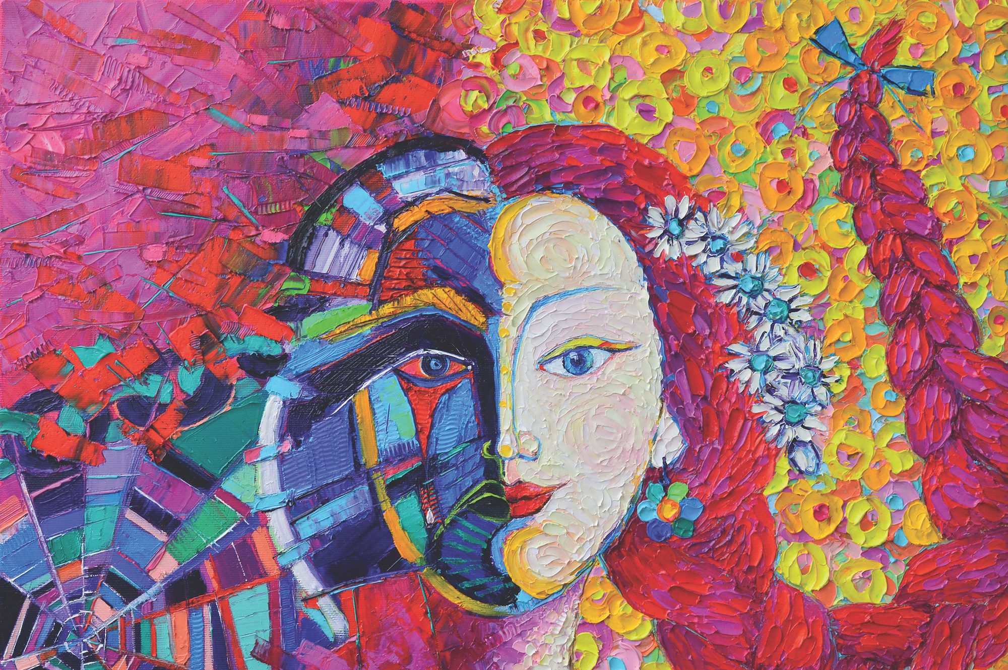
ANA MARIA EDULESCU
Winter 2018
The Art of Healing
When you asked me to represent the transformative power of art, I was thinking instantly of how to paint metamorphosis. Practically my approach started with the concept. The transition from torment to freedom and peace, from darkness to light visually solved from an abstracted spider web to serenity, from cold hues and rectangular, acute shapes to warm tones and curved lines. This is how “Metamorphosis “ was born.
edulescu-ana-maria.pixels.com
Instagram: @anamariaedulescu
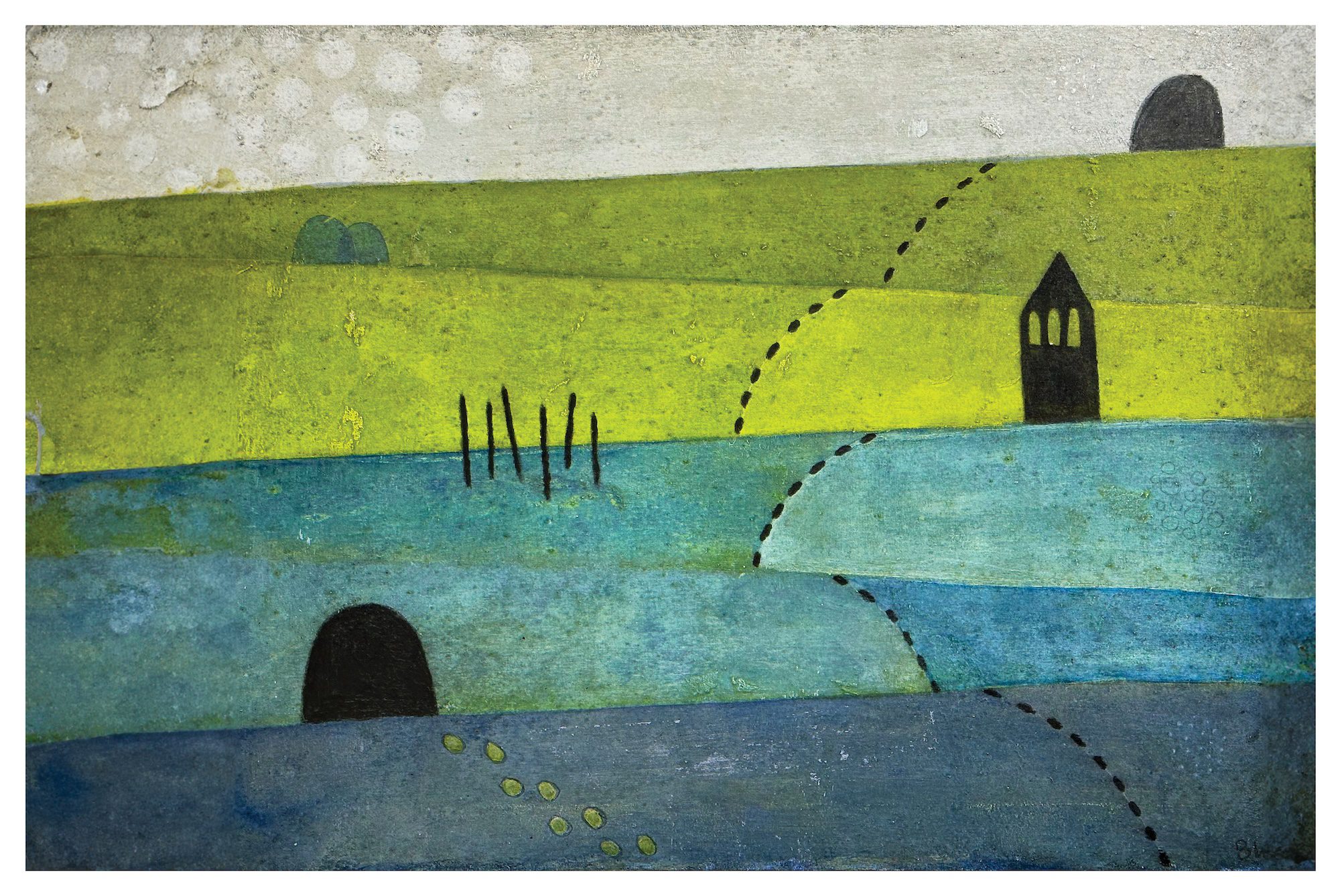
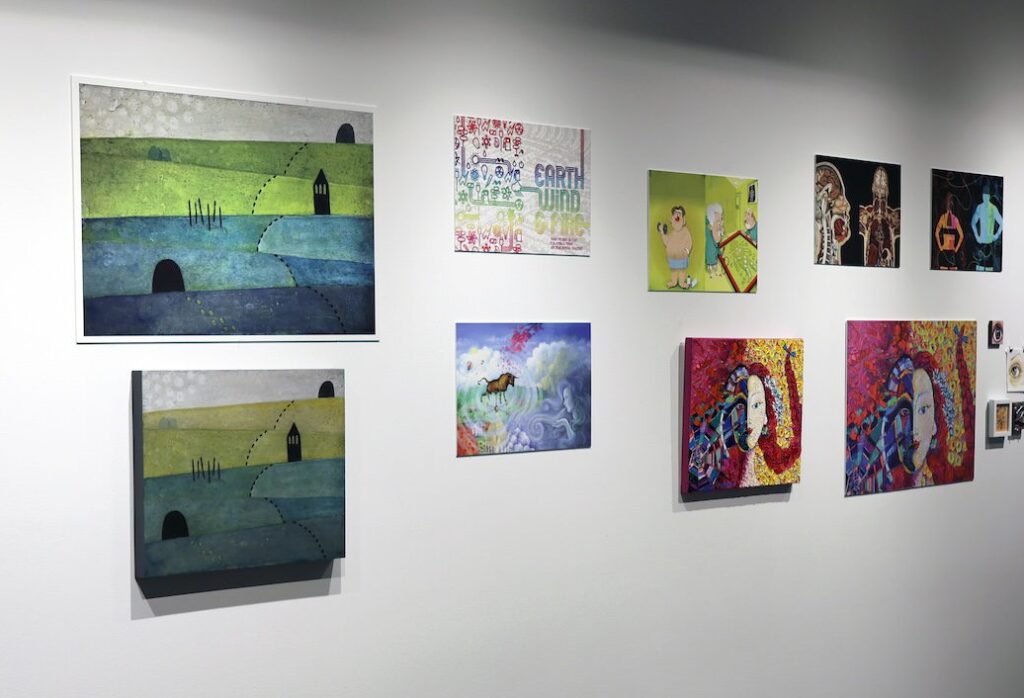
BRIAN WETJEN
Fall 2023
Going the Distance
First of all, it was fun to have an “assignment” to work towards. Knowing the theme for the issue helped me conceptualize what that might mean to the audience in general, and it also helped me think about what it meant to me as a student at UNO.
Something that kept coming back to me was location and presence. For most of my time at UNO, I was living with roommates on the edge of Dundee, so it was quick and easy to get to campus. I’d regularly ride my bike when the weather was nice, as I could avoid dealing with parking and there was a rack right between the Durham Science building and the Weber Fine Arts building, and those were the two places where I spent the most time.
Riding through the gentle hills surrounding UNO was always so pleasant. Much better than driving. Though most of the time I was driving to campus and then walking from where I parked. That would also frequently be in the Elmwood area. I particularly liked when I was headed to the sculpture studio, as it was right on the edge of Elmwood Park and the woods. There was a beautiful view out the studio’s back door.
All of these things came back to me as I was thinking about “Going the Distance” and how UNO was both nestled in my mind as this place in the midtown zone surrounded by beautiful rolling hills and as a period in my life where I experienced tremendous growth and learning in so many ways.
Rolling hills and paths kept coming up for me, and UNO’s position in the city. I kept seeing the bell tower and open spaces, the roads and sidewalks, and the openness of the space amongst the surrounding neighborhoods.
I wanted to capture some of that and connect the image to my experience of UNO as a commuter and as an alum who sees the campus all the time but doesn’t interact with the university on a regular basis.
Something I didn’t anticipate out of the process was finding more ways to incorporate storytelling into my work. I’ve been in a fairly abstract and minimalist mode for quite a while where the concepts driving my imagery haven’t necessarily been apparent. Putting a specific location into context within my work and having an actual experienced narrative supporting it gave me a lot of ideas about how to find inspiration for new ideas.
Most of all I’d just like to share and express my gratitude for being involved. I felt so fortunate to be able to study fine art in college. That was facilitated by all I had learned in the Computer Science program and recognizing that I had an incredible opportunity to focus on Web Development as a career and that I’d had enough math and programming classes for that career path. Switching my major to Fine Art allowed me to follow what I knew was my calling. Working on the magazine cover art brought me back to many of the things I hadn’t thought about or felt for quite some time. So now I’m sitting with great feelings of gratitude for my education and college experience, my further pursuit of my art and studio practice, the relationships I have with friends who appreciate my work and the school where I found the space, community and support for what I wanted (and needed) to learn.
brianwetjen.com
Instagram: @wetchman
